Yung Frysk
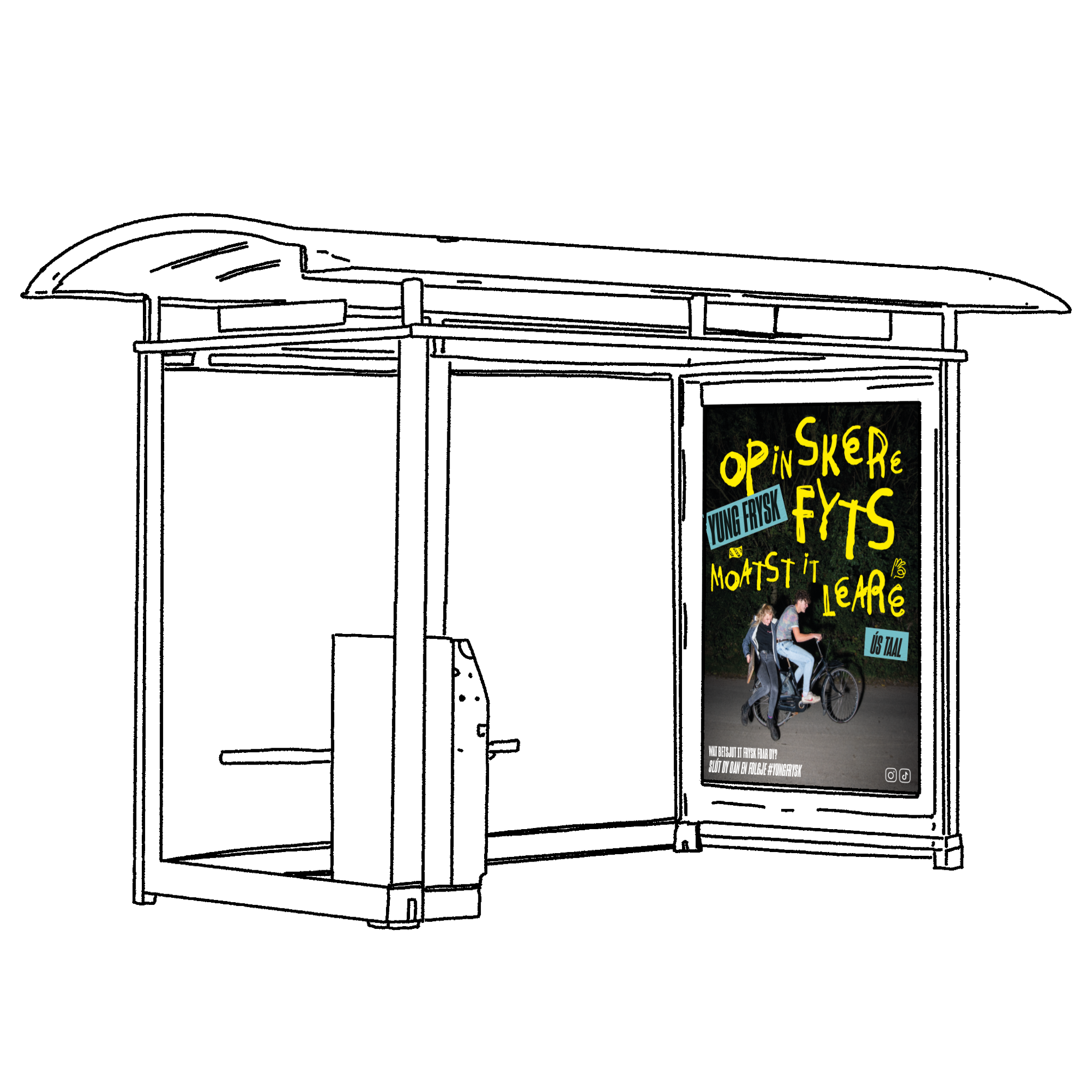
GH+O, an advertising/communication agency, approached me to create a custom font for their ‘Yung Frysk’ campaign. ‘Yung Frysk’ aims to promote the Frisian language among the teenage population in Frisia. The campaign’s core idea is to encourage them to embrace the language, allowing them to make it their own and speak it in their unique way. For this campaign, I designed a font and regularly provide them with illustrations to be used in both online and offline campaigns, ranging from bus advertisements to booklets and even Spotify campaigns.
For the project ‘Leen Een Fries,’ I was asked to design their new identity. ‘Leen Een Fries’ is a cultural initiative aimed at promoting Frisian culture and showcasing the variety of subjects currently thriving in Frisia. I was responsible for designing the corporate identity, the logo, the website, and all the marketing materials.

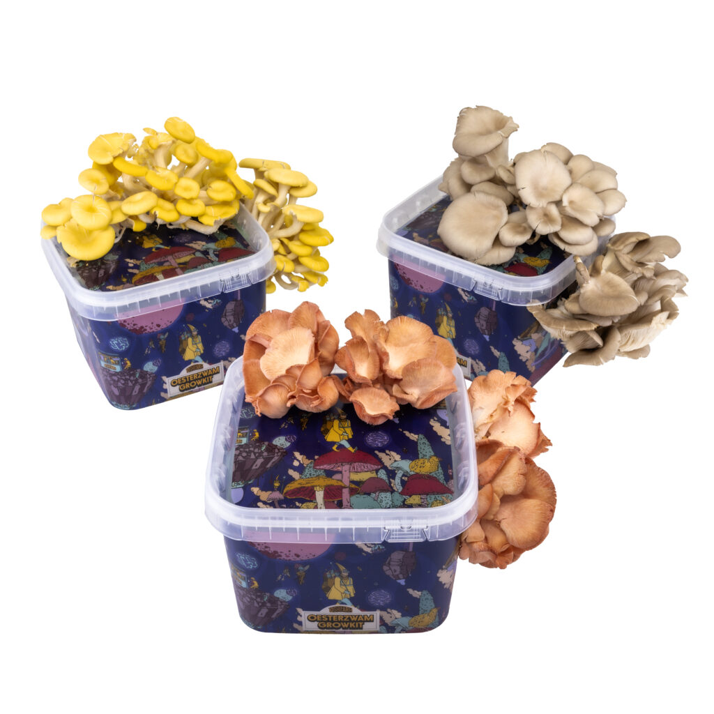
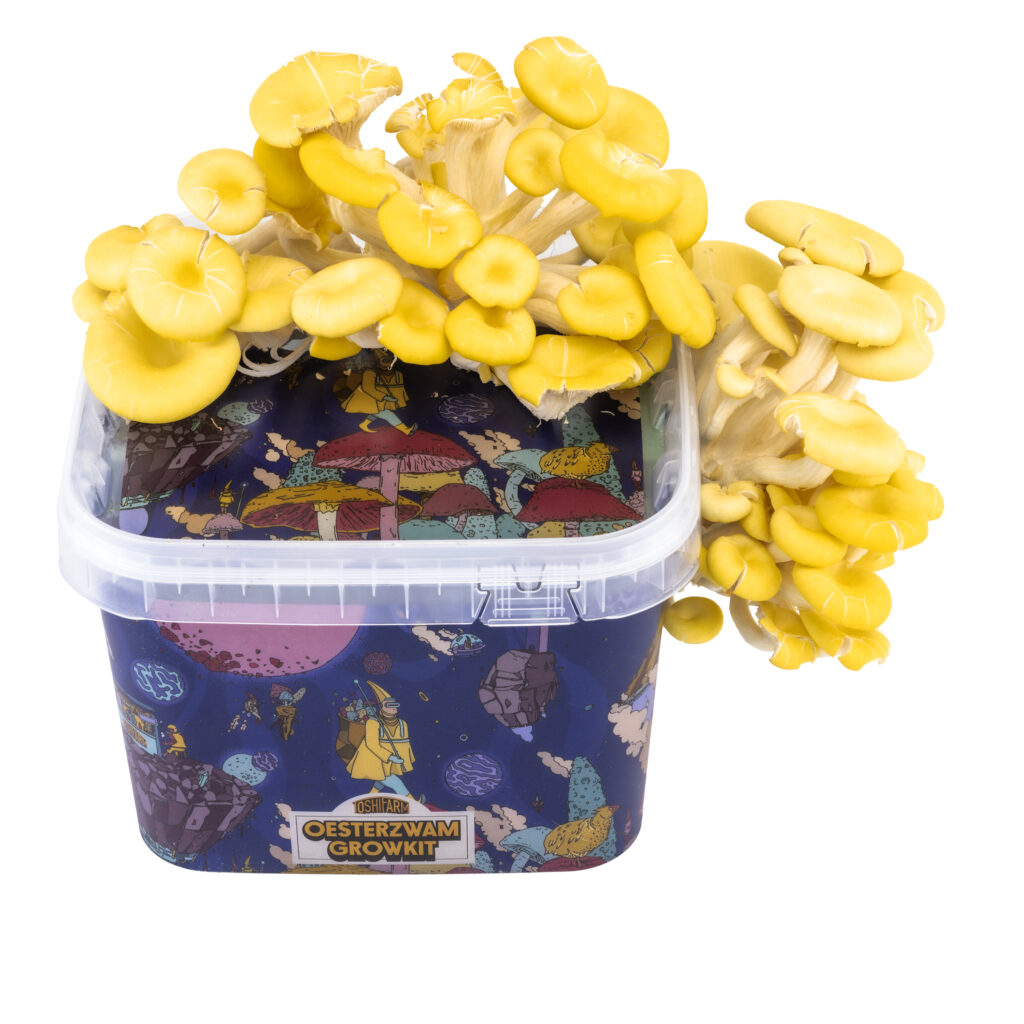
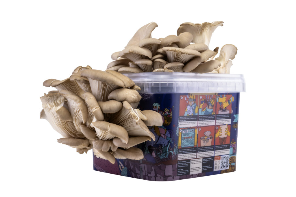
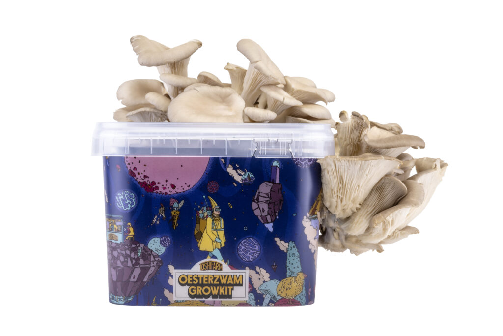
I was approached by Toshi Farm to create the entire new identity for their company and products. They specialize in selling Mushroom Grow Kits, with the main focus being on providing growing buckets that come with fully detailed illustrations. The intention was to create a product that not only serves a practical purpose but also doubles as a work of art that customers would proudly display in their windowsill.
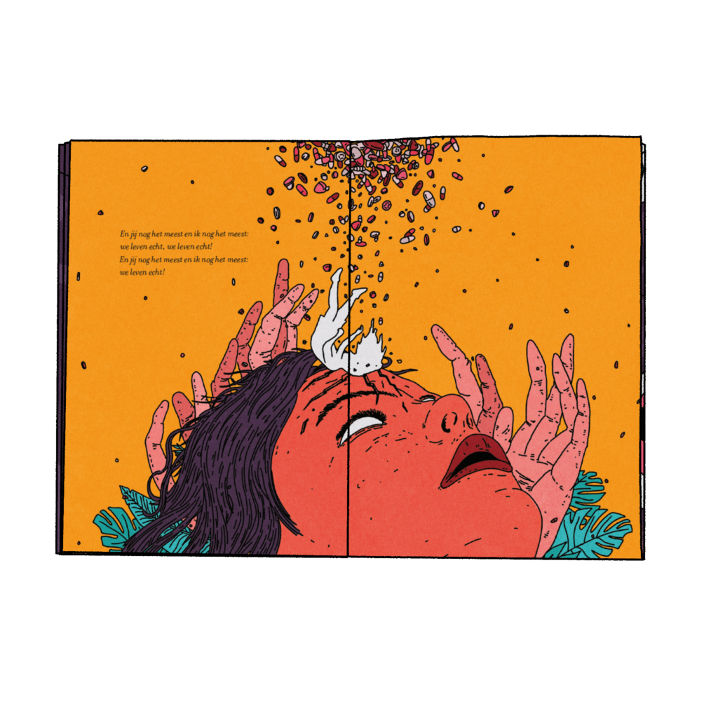
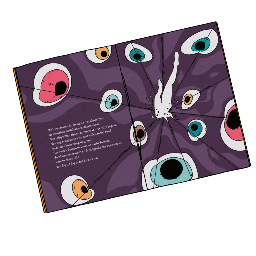
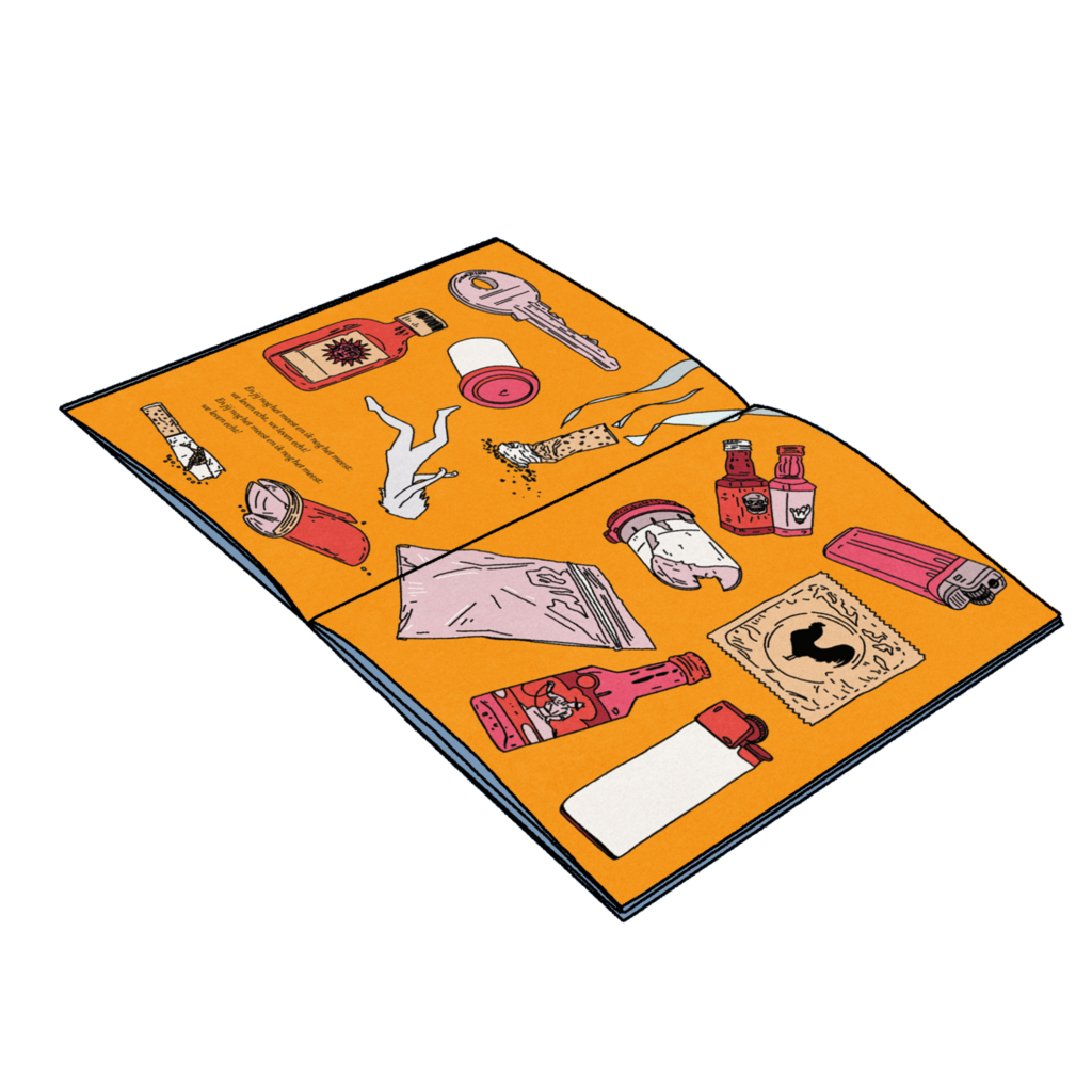
Simultaneously with the release of Esther de Jong’s debut album, publisher ‘Loopvis,’ a renowned publisher with a penchant for amazing projects, sought to elevate the musical experience and create a ‘analogue music video’ to one of the album’s tracks. They track ‘We leven Echt; is released booklet, featuring the lyrics of the song and fully illustrated by me.
For Esther De Jongh er debut album I have provided all the artwork and illustrations.
The artwork consists of a fully illustrated cover and back design and a fully illustrated poster. Jantina Talsma provided beautiful photos for the innersleeve and booklet. The theme of the album is a black, bleak, and darkly humorous self-portrait, and I aimed to capture this vibe in the artwork.
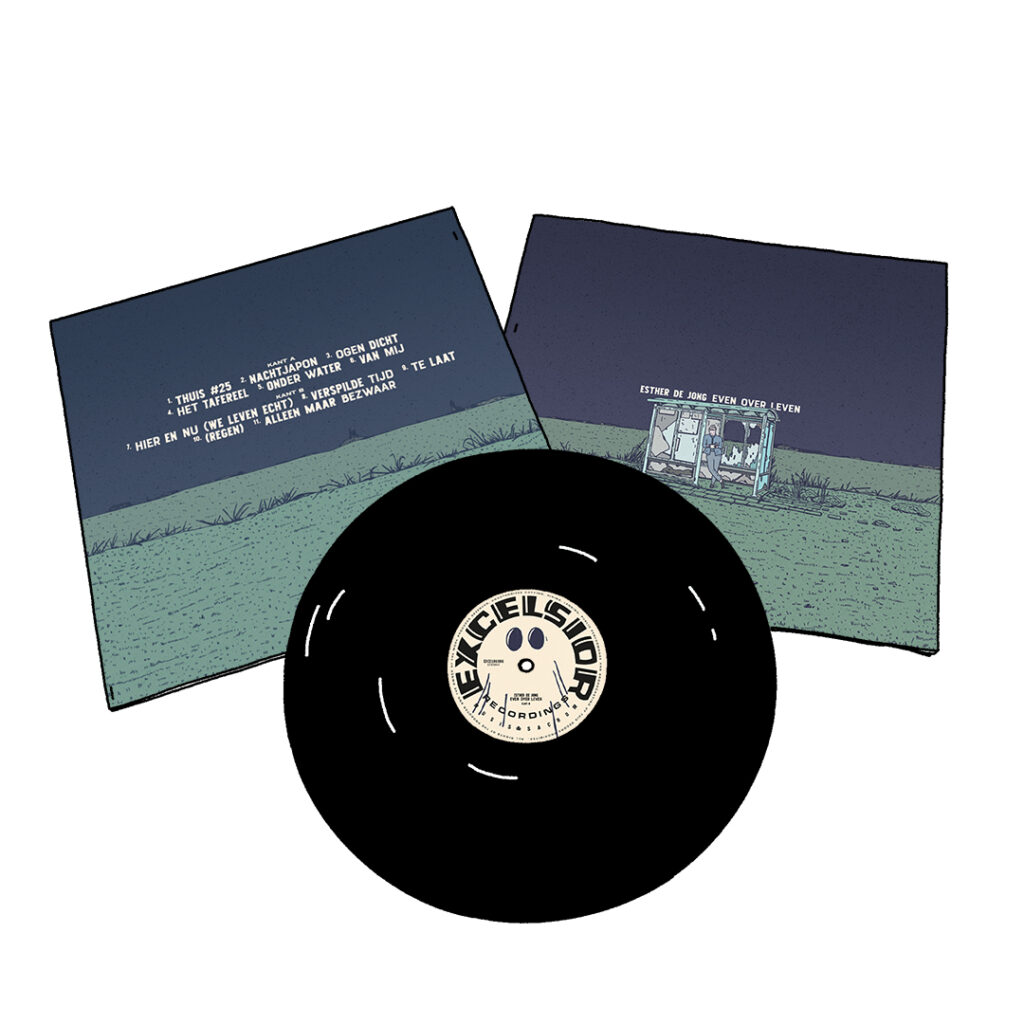
Front and back
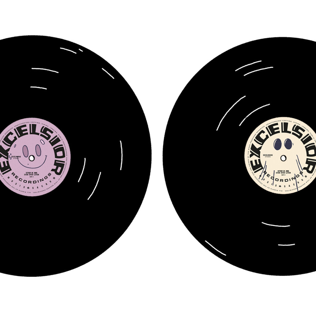
Side A and B
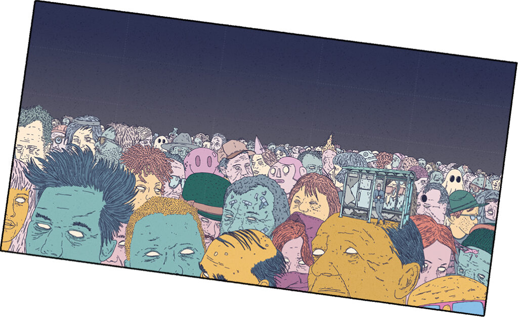
Fully illustrated inlay/poster
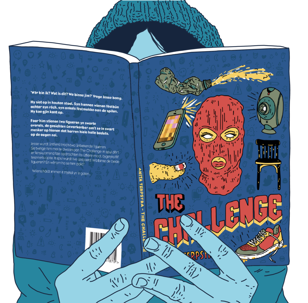
In 2019 I was asked to design a cover and illustrations for a educational children’s book. Additional to the book there comes a teaching program, student’s workbook and promotional campaign – where I also provied illustrations for.
The book is a Black Mirror-esque story, but written for for kids. It warns about the dangers of sharing personal information on the internet, and the possible blackmailing that can come with it. The story follows a young boy who has to live-stream some challenges to keep his kidnapped friend safe.
Het Achterland” is a cultural organization tasked with providing cultural education for children and encouraging them to try new things. They needed a new identity with an emphasis on experiments and fun!
The main part of the corporate identity is the font, which serves as the primary eye-catcher. In addition to the font, I finalized the look and feel with a set of 25 illustrations and other graphical elements, providing a creative toolbox for them to work with.
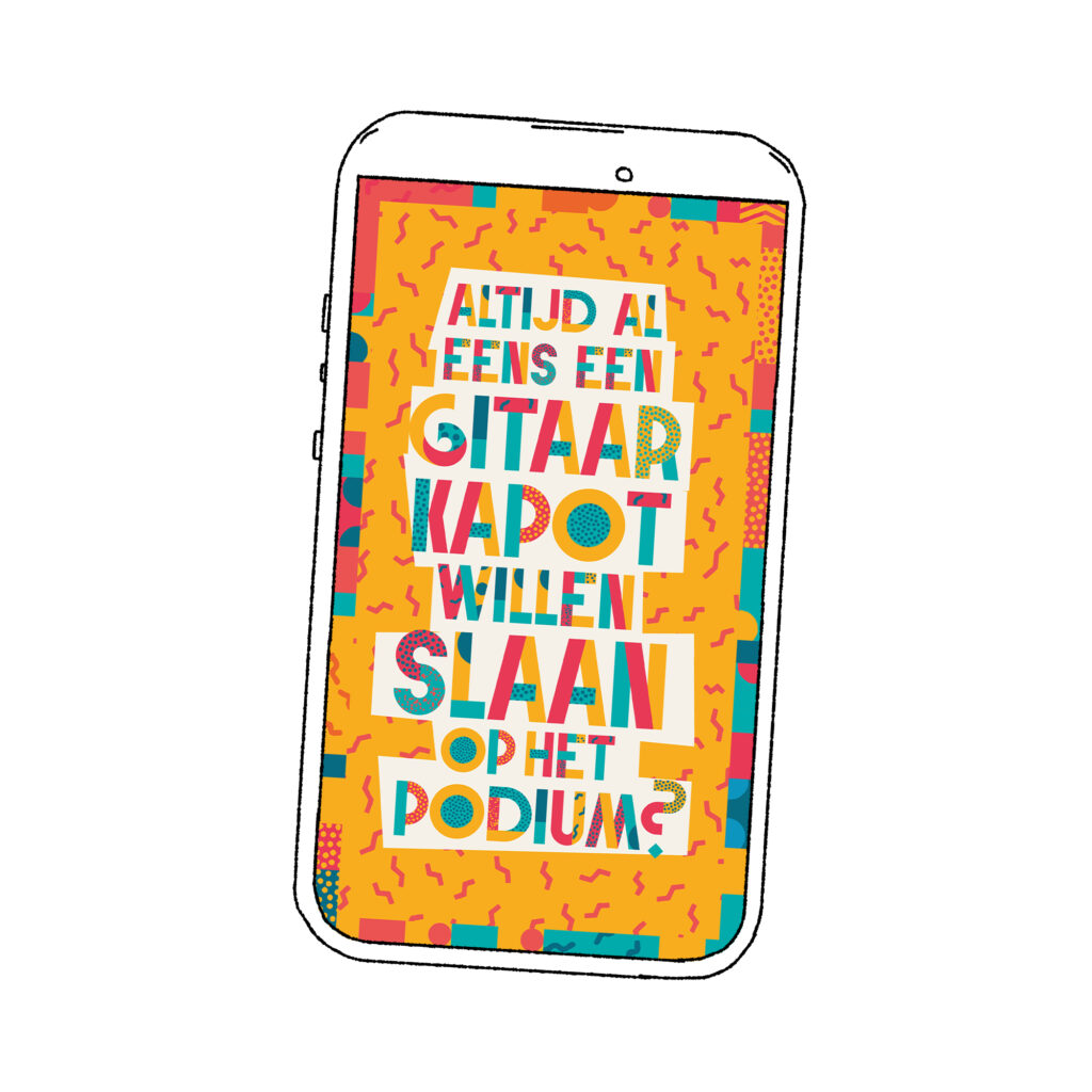
One of the Instagram advertisements.
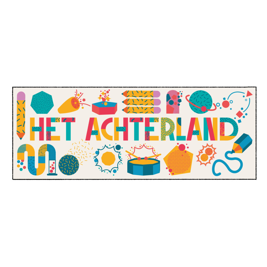
A banner, showcasing some of the illustrations.
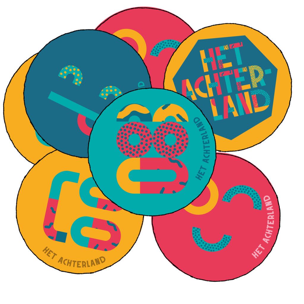
Stickers
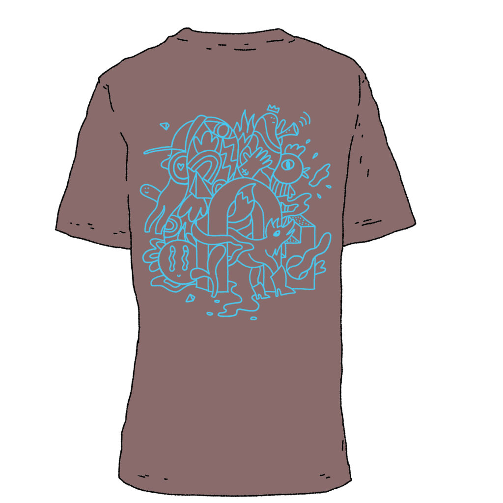
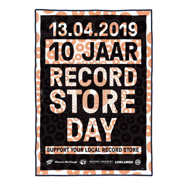
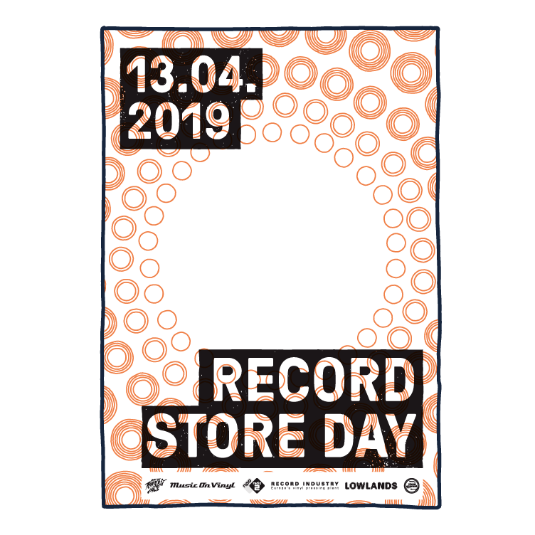
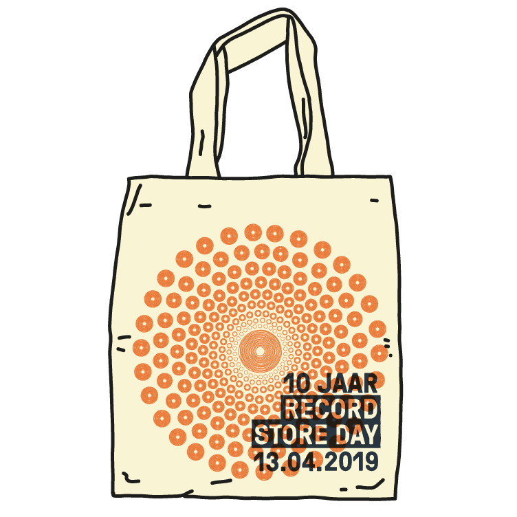
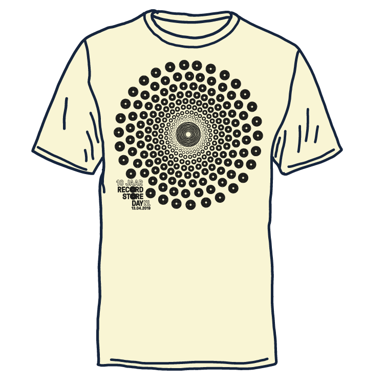
In 2019 I was asked to design all of the art work and merchandise for the 2019 edition of Record Store Day. This included posters, advertisements, banners, bags and slip mats.
In 2015, I was asked to design the visual identity for Neushoorn, the newly built music venue in my hometown of Leeuwarden.
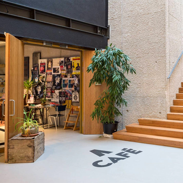
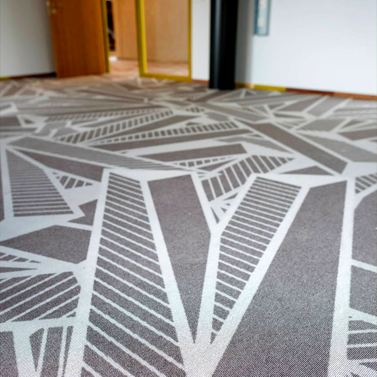
This included a wide range of designs and products, like the venue logo, the corresponding identity, internal and external signage, the tokens, the company apparel, the marketing’s tone of voice, and the entirety of their advertising. Also, I designed the carpeting for the entire building. Pretty neat, huh?
Neushoorn is the Dutch word for rhinoceros. I wanted to stay clear of an actual rhino, so I went for a shape that is recognizable, but also conveys several meanings.
It could be an arrow pointing up, as Neushoorn is one of the most northern located music venues in The Netherlands. It could also be the partial shape of a letter N, or a horn of a rhinoceros from up close.
The most important concept of the logo is that it’s easy to recognize and remember, even without text.
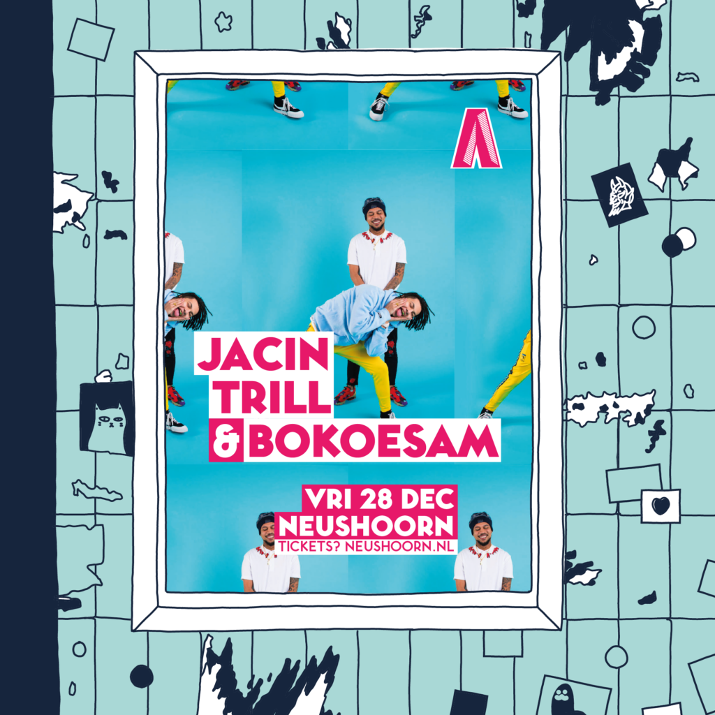
The logo itself is very versatile; all sorts of colors, patterns and background can be applied to it, without a decrease in power of expression. This way, the logo is durable and maintains its livelihood and freshness throughout a long period of time.
The logo is accompanied by Toronto Subway, a notable and striking font that works in glaring headlines as well as small text.
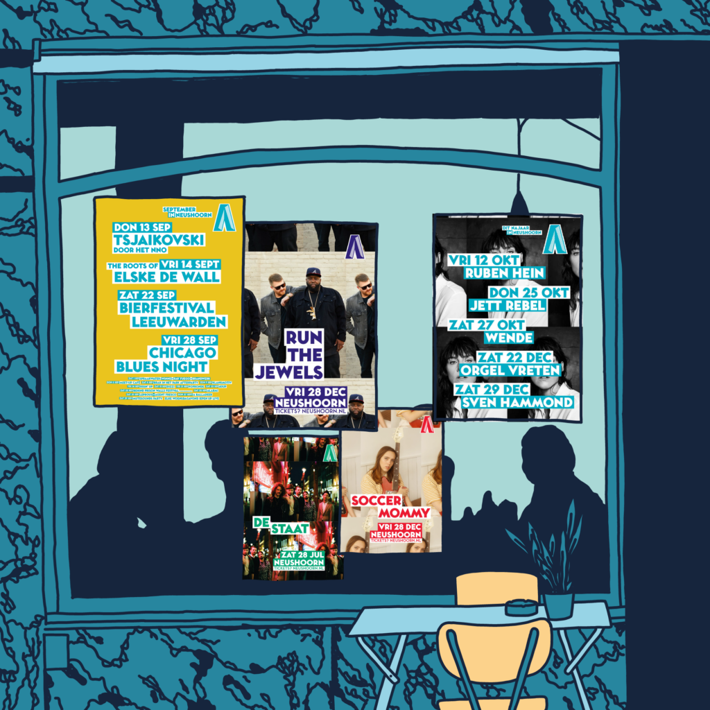
For the marketing department, I created templates for posters, adverts and social media.
In 2018, I innovated those templates, to keep it all up-to-date.
The templates ensure that the viewer’s focus is divided 50/50 between the artist and the venue. Every poster should unmistakably be an advert for Neushoorn, without diminishing the focus on the artist that it’s promoting.
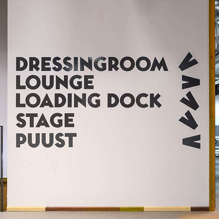
I applied the shape of the logo to a lot of the interior of the building, as well as other appurtenances. From carpeting in the building to internal signage and the tokens to pay for drinks with.
Various logos I made over the years
