Neushoorn
In 2015, I was asked to design the visual identity for Neushoorn, the newly built music venue in my hometown of Leeuwarden.
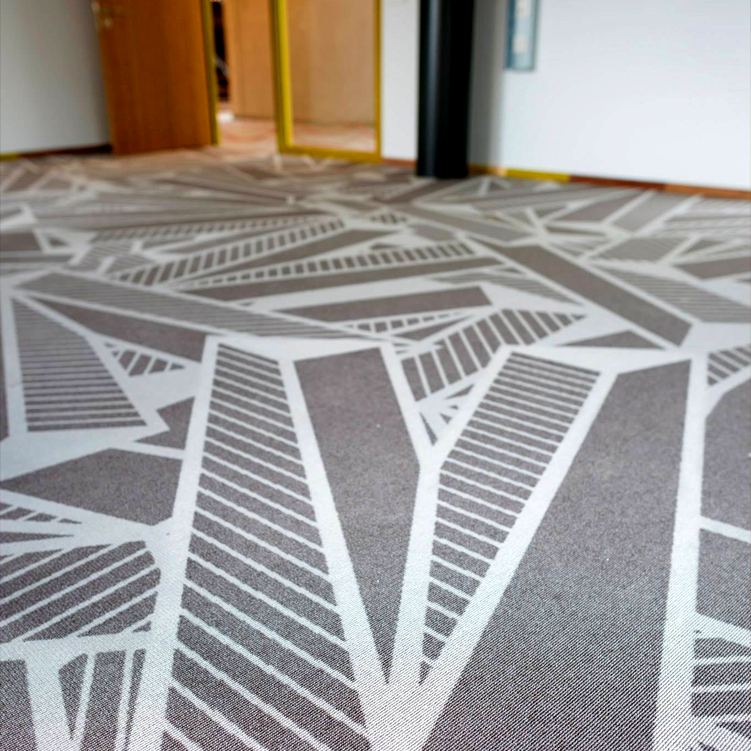
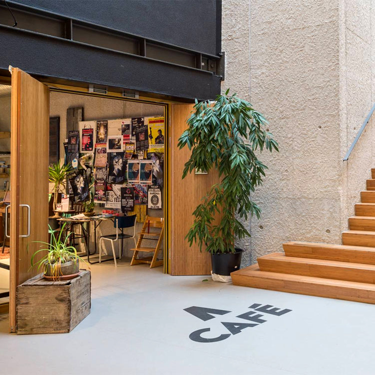
This included a wide range of designs and products, like the venue logo, the corresponding identity, internal and external signage, the tokens, the company apparel, the marketing’s tone of voice, and the entirety of their advertising. Also, I designed the carpeting for the entire building. Pretty neat, huh?
Neushoorn is the Dutch word for rhinoceros. I wanted to stay clear of an actual rhino, so I went for a shape that is recognizable, but also conveys several meanings.
It could be an arrow pointing up, as Neushoorn is one of the most northern located music venues in The Netherlands. It could also be the partial shape of a letter N, or a horn of a rhinoceros from up close.
The most important concept of the logo is that it’s easy to recognize and remember, even without text.
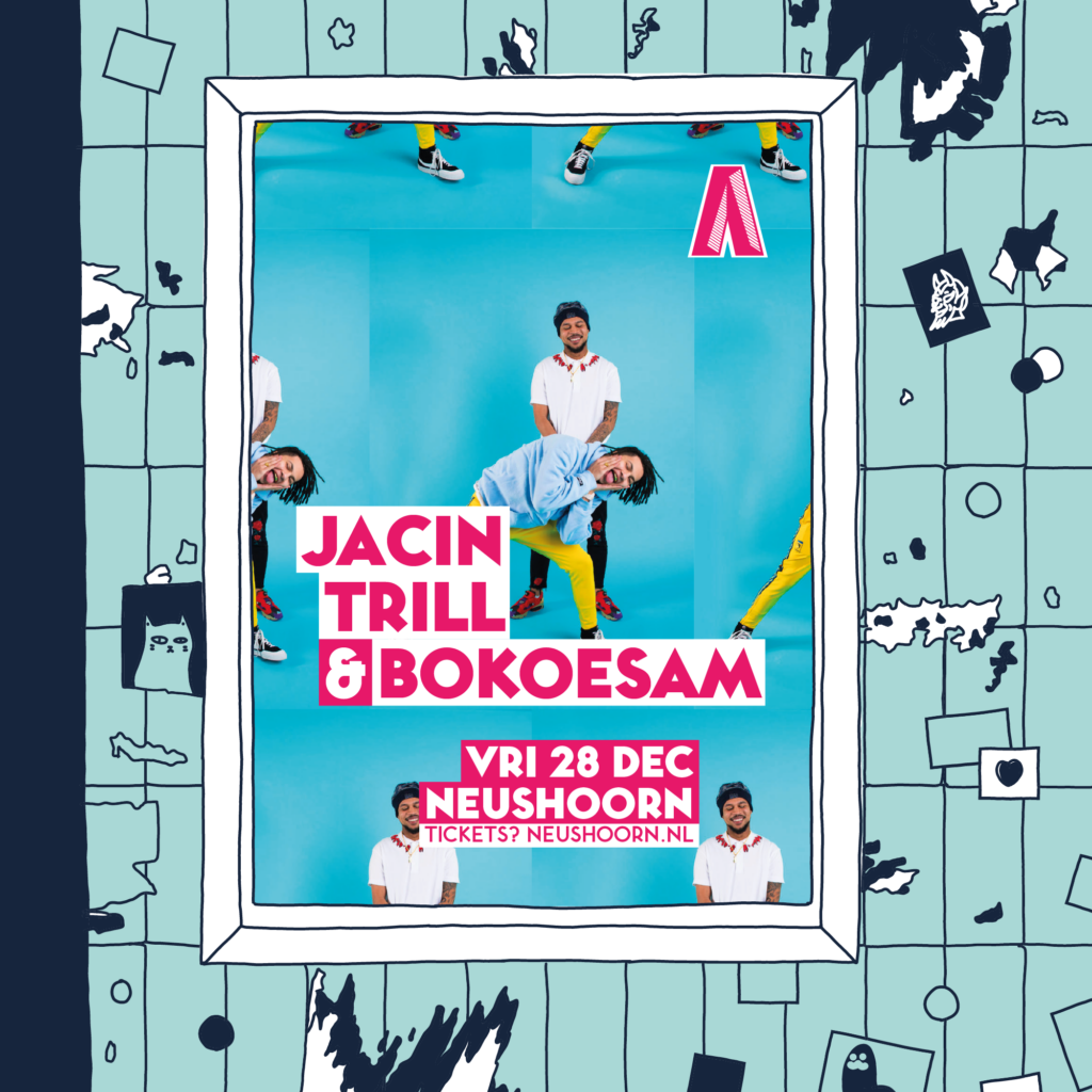
The logo itself is very versatile; all sorts of colors, patterns and background can be applied to it, without a decrease in power of expression. This way, the logo is durable and maintains its livelihood and freshness throughout a long period of time.
The logo is accompanied by Toronto Subway, a notable and striking font that works in glaring headlines as well as small text.
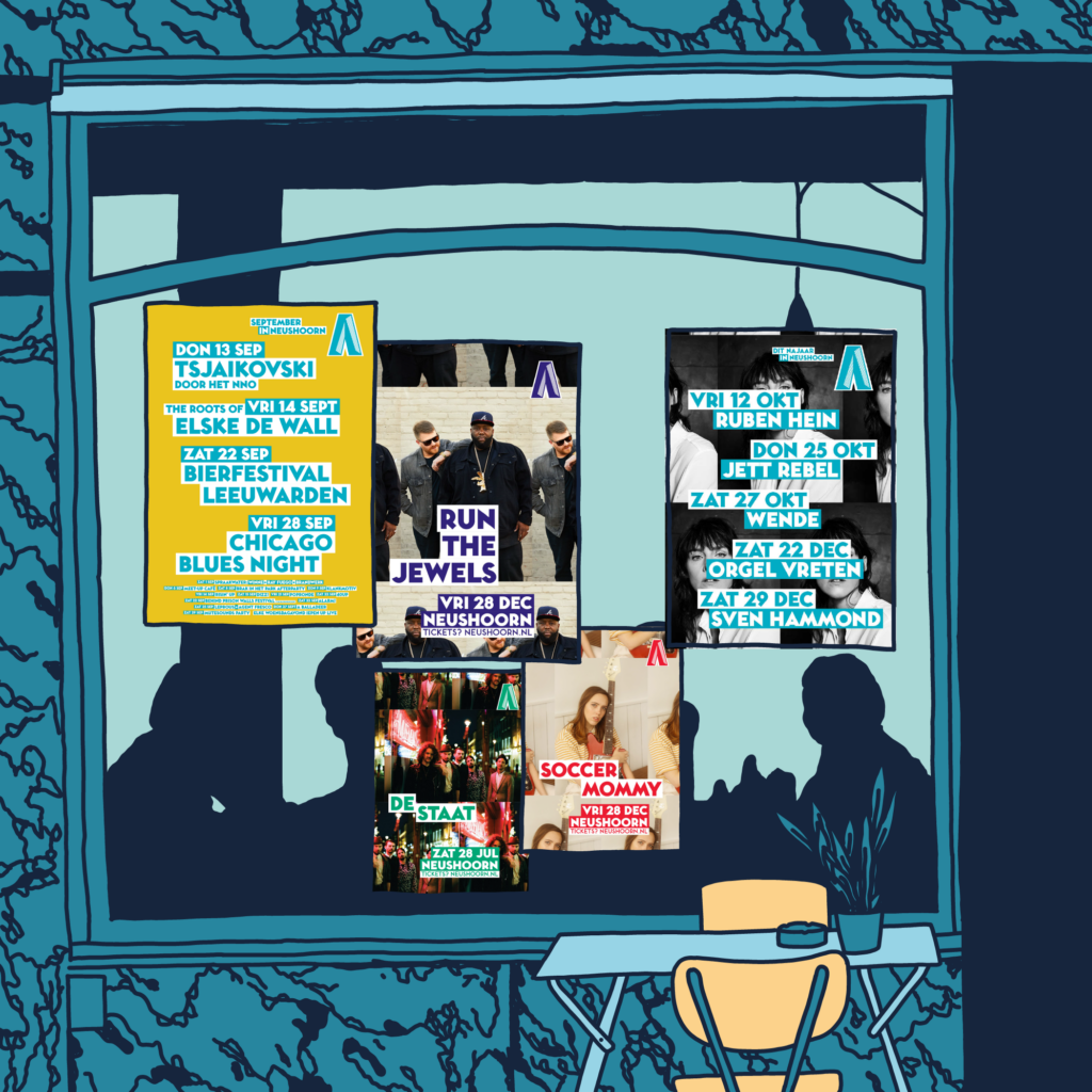
For the marketing department, I created templates for posters, adverts and social media.
In 2018, I innovated those templates, to keep it all up-to-date.
The templates ensure that the viewer’s focus is divided 50/50 between the artist and the venue. Every poster should unmistakably be an advert for Neushoorn, without diminishing the focus on the artist that it’s promoting.
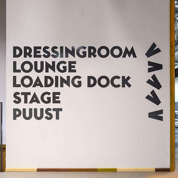
I applied the shape of the logo to a lot of the interior of the building, as well as other appurtenances. From carpeting in the building to internal signage and the tokens to pay for drinks with.
